Wednesday, December 3, 2014

Post #10

Compare and contrast vector graphics and pixel images. 
Pixel images (raster) are made 

up of tiny pixel, while vector images are made from mathematical formulas which form 

geometric shapes. Pixel images loose quality when manipulated and increased in size. 

Vector images do not usually, and so they have better resolution.


What resolution is necessary to print raster images?

300 dpi (dots per inch) for printing.


What resolution is necessary to display raster images on the internet?
 

72 dip for on the internet. 

Post #9

Who is Steve Jobs?

Steve Jobs is the founder of Apple company.
What company was he CEO for many years?
Apple Inc.

What did he do for the computer industry?

He completely revolutionized the way parts of computers and technologies are used and he integrated things differently than ever before. 

How did this man impact the graphic design industry?
He was from a nontechnical background, and saw technology in more of a design way, which allowed him to be very innovative. He created with Apple, a whole new line of technological products designed in such simple, easy to use, and sleek ways that was very different at the time. He truly changed the way people use and look at technology--like music players, computers, and home entertainment. 

POST #8

Why must designers pay close attention to how color is utilized within a composition?

This is so that the color can be used correctly to portray the message being sent.

Why is the color wheel an important tool for graphic designers?

It is important because it adds life and color to a piece of work, in addition to meaning.


Find an example of neutral colors utilized within a design (hint: google poster design). 

Near the sample, discuss why you feel the designer included neutral colors within the 

composition.
I believe the designer used neutral colors within this composition because they wanted to bring out each of the details without having something standing out too much.
Briefly describe how we "see" the color of an object?

Specialized cells in our eyes called "cones," transmit the reflected light waves so we can 

see.

POST #7

Describe white light? 
White light is all the colors of light combined in the visible light spectrum. 

How do we see color if objects "have no color of their own"? 

Light reflects the color we see and absorbs all the other six colors.

What seven colors result when white light is refracted through a prism? 

Red, orange, yellow, blue, green, indigo, blue, and violet

Describe hue? 

Hue is what we use to describe a specific color; it is the color's name./

What happens with white? 
White changes a color to become lighter.

What happens with black?

Black changes a color so that it is darker.


How color is perceived depends on what?
It depends on how the retina in the eye detects the reflected color of light.


What is a color wheel? 
It is a colored circle with different sections used to show the relation between colors.


What are primary colors? Name them? 
Primary colors are colors that cannot be blended, and are used to make other colors. The primary colors are red, yellow, and red.


What are secondary colors? Name them? 
Secondary colors are colors obtained by mixing primary colors. The secondary colors are purple, orange, and green.


What are tertiary colors? Name them? 
Tertiary colors are colors made by mixing a primary and secondary color. The tertiary colors are 
red-orange, yellow-orange, yellow-green, blue-green, blue-violet, and red-violet.

What are neutral colors? How can they be created? 
Neutral colors are colors that don't usually show up on the color wheel. They can be created  by blending all 3 primary colors, or by blending complementary colors.


How can a neutral color help a design?
It can help designs by providing a more flexible feel.


What are complementary colors? Name them? 
Complementary colors are colors which cancel each other when combined. Examples would be red and green, or blue and orange.


What is color value? 
It is the dark and light of the color.


What is a shade? 
It refers how dark a color is.


What is a tint?
A tint is a shade or variety of color.


What is saturation/intensity?Saturation is the intensity of a color. It states the amount of pigments present in a color.

What happens when you mix complementary colors together? 

You get a tertiary color.

What is a color scheme? 
It is a combination or arrangement of colors.

Describe a monochromatic color scheme? 
The colors go well with one another and provide a soothing effect.

Describe an analogous color scheme? 
They are colors next to each other on the color wheel. The colors are similar.


Describe a complementary color scheme?
They are colors opposite each other on the color wheel.

Describe a split-complementary color scheme? 
It is a variation of the complementary color scheme.


Describe a triadic color scheme? 
It is colors that are evenly spaced around the color wheel; tend to be vibrant.


What colors are considered to be warm colors? 
red, orange, yellow


Describe the psychology of a warm color scheme?
Warm colors can increase metabolism, blood pressure, and make people feel warm and cheerful.

What colors are considered to be cool colors? 
blue, green, purple

Describe the psychology of a cool color scheme?
Cool colors can make people feel relaxed and calmed. It is also a very clean color.

Why is important to consider which colors are being used within a design?
It is important so that the colors can bring out the meaning within the design. Something more fierce with a warmer color and something calming with a  cool color.

Wednesday, October 15, 2014

Post #6

What is the pen tool used for?
The Pen tool is used for drawing lines, curves, patterns.
 
How can you manipulate a path/line in Illustrator? Discuss the use of the white arrow tool. Pen+, pen-,and convert tool.
You can make a line, a curve. Using pen+ you can make a line wider and using pen- you can compress it. The white arrow tool is to select directly.

How can you utilize the layers palette in Illustrator?
The layers palette is very useful when creating an image with different shapes and layers. You can move shapes to different layers to create a better image.
 
How do you create a clipping mask in Adobe Illustrator?

You draw using the drawing tool. You use the layers palette, and select "create clipping mask" from the main menu.

Post #5

                                             Value


This is a design that utilizes the art element of value. Value is used by using different shades of color. This design goes from black, to dark gray, to light gray, to white. Value is very important, it shows depth and is used also to show where the light might be hitting the image.


                         Shape


   This design is formed by many different shapes. There are any shapes combined to form an even bigger one dimensional shape. Shape is used in pretty much all designs, a shape is lines that come together to form an image.


          Line


This design is made up of no more than lines. It contains both thin lies and thick lines. These lines are all different sizes and go on different directions to show some sort of swirly design. Lines are used for mostly every design, they make up the shapes of design. 


Color
The design below consists of many different colors. This design contains different shades of these colors to make the image come to life. color is very important in a design, because of the colors used, one is able to interpret this scene takes place during the day and not at night. 


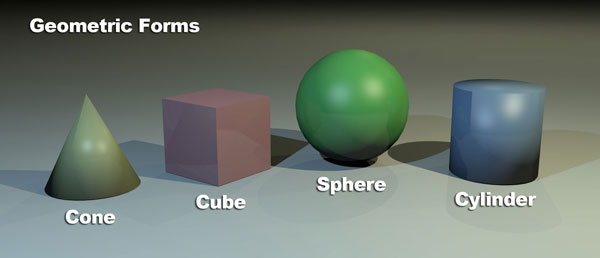
Form
 

This design below, is an example of the last element of design, form.This is because the balls have a 3D feeling to them. They are more than just shapes, they look more realistic. Form is used as a way to make images look more realistic and make objects appear as if they are popping out of the paper or screen.

Post #4

Why/how can icons be used to communicate? 
Icons are an effective way to attract users, they convey a message in a simple way, people find images easier to understand than a bunch of words.

What is the difference between copyright and public domain?
Copyright is a legal concept that grants authors and artists control over who uses their creations. On the other hand, public domain is the set of creative works that are not protected by copyright law

How can you avoid plagiarism in this class?  In other classes?
By citing the sources, avoid using someone else's words and use our own.